Leadership Dashboard
Executive Performance Management Dashboard Suite
I worked on the Leadership Dashboard while working at Redacted, Inc.
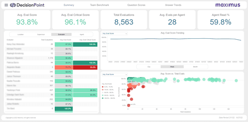
This initiative delivered external and internal leadership a series of performance management dashboards and reporting which provides benchmarks by segment, division, contract (project), team and individual agent. This includes various KPI scores and how they compare to the team, the LOB, and the project targets as a whole.
Audience
Project leadership of all levels
Role
UX & Data Visualization Designer
Tools

Solution
A suite of MicroStrategy dashboards that allows users to access project insights when they desire rather than waiting for them to be provided. MicroStrategy's interactivity allows users to select visual data in order to drill in on and filter other graphs and data.
My Thoughts
Data Visualization design is a niche and complex discipline. What I find interesting about it is the number of different ways you can represent the same information, and how many different ways the user can arrive at it. Data itself is ambiguous, and it is my job to turn it into visually interpretable information. This often involves trying and failing a few different ways, or designing on the run as I like to call it. This is the largest and most cross-functional dashboard design I have undertaken to date.
Background
This initiative is an expansion of our existing DecisionPoint for Business Intelligence (DP4BI) Product Suite, which serves business users relevant project information and key performance indicators in several dedicated content modules. These modules include areas like Customer Satisfaction, Quality Assurance, Speech Analytics, Workforce Management (Staffing), as well as Front Office and Back Office call center performance metrics. The Leadership Dashboard will provide a comprehensive view of these different content areas in one consolidated view.
Purpose
The purpose of this initiative is to provide high level business performance at the project level and above through actionable data insights that can be used to drive performance management across the segment.
The Problem: Before this initiative began, Maximus had no standardized tool across all contact centers and back offices to measure and evaluate all agent performance metrics in a single view.
The Audience: project directors and segment leadership, eventually expanding to executive leadership
Scope - Release 1
For the first release we concentrated on two Content Areas and two Leadership Personas. We decided to build separate applications based on the two personas. This way we can provide only the necessary level of insight into the data based on the user's needs. Both applications include multiple dashboard views containing all of the relevant content area information.
Team & Role
I was primarily paired with one front-end developer and one back-end developer to bring this project to life. The three of us worked with the product owner to connect with the relevant stakeholders throughout the design and development process.
I was responsible for designing this new suite of dashboards from the ground up, working with stakeholders to provide and iterate on a complete user flow. My responsibilities included:
UX Research & Design
Data Analysis & Visualization Design
Interaction Design
Prototyping
Quality Assurance Design Review
Architecture
MicroStrategy is the primary dashboard application for DecisionPoint, so we chose to build the new dashboard accordingly. The system architecture is detailed below.
Research
Interviews
I worked with end users and stakeholders to better understand the way they currently use and access this data. We looked through their excel reporting to get a better idea of the types of insights the users are most interested in.
Data Analysis
The two content areas we had designated for the first release (Call Center and Staffing) contained many KPIs familiar to myself and my team. The primary need was to see how these metrics are performing within a given time window at a Project level.
The ability to see how performance is trending over time and compare it against pre-defined benchmarks and prior year's performance were the main needs not currently being met by reporting. At higher levels, being able to compare across projects and business units is the goal.
Empathize
I worked with the primary stakeholders to better understand the needs of the two personas we had identified for the first release. We then came to some decisions regarding how to meet their needs and deliver useful insights.
Single Project Lead: The highest person in charge of a single project. They require an operational view, only looking at a single project at a high level. They need daily but not hourly level performance insights.
Multiple Project Lead: Above Single Project Leads. A Strategic role responsible for several projects. They have a Daily check in, and their first view will be an aggregated roll-up across projects, with the ability to drill-in to the Single Project Lead view.
Determinations: Each persona cannot see their peers info, but we may add this capability later. Each content area may be at different time scales. Projects may have specific benchmarks, but their will also be a segment level benchmark. As we expand to higher level leadership, everyone will be able to drill all the way down to the Single Project Lead level.
Single Project Lead
Multiple Project Lead
User Journey
Given the high level nature of this dashboard suite, and the various levels of user, there are many different paths a user might take when accessing the dashboard. One example is a Multiple Project Lead user doing a health check before their daily check-in meeting:
Multiple Project Lead user visits dashboard, it opens to the Summary view
Looking at the Absenteeism metric on the daily level, they notice an uptick.
The user navigates to the WMO page of the dashboard.
They select Absenteeism from the bar chart drop-down to see how different projects are faring.
Identifying a project that is below their target, they select the corresponding bar to filter the trending visual. This project seems to be causing the uptick.
They select the Single Project Dashboard link from the page footer, then select the identified project in the resulting prompt.
The Single Project Dashboard opens to the WMO page, and now the user can see a more detailed visual regarding Planned and Unplanned Absenteeism.
The user then contacts the appropriate Single Project Lead user to discuss the issue further.
Ideate
I begin my design process by whiteboarding. I gather all of the requirements into stickies, as well as any relevant notes, images or other information. I like to be able to see everything at once, and copy it or move it around as I organize my thoughts.
Wireframes
After whiteboarding out all of the requirements and my thoughts, I begin with lo-fidelity wireframes that I can easily manipulate. They begin less organized, but as I start to nail down a layout that makes sense, I make sure everything is aligned and labeled so that I can include contextual information about what each component represents.
Iterating
When I am satisfied with the general flow, I make a medium-fidelity mock-up using some pre-drawn graph artifacts I have saved. These mock ups serve as a visual aid to the team, stakeholders, and users during brainstorming sessions and reviews.
As I go through this process, I test out certain features with dummy data in our visualization software, to determine if there are any potential improvements. In this case, I was testing various ways of drilling from the Multiple Project Lead level into the Single Project Lead level.
Mockups
As I go, I continue to update the mock-ups with higher fidelity imagery and specific interaction details. I will continue to work with users and stakeholders throughout this process to ensure the design decisions are helping to deliver the optimal user experience, and that any questions I have are being answered.
Finally, I clean up the completed version of all mockups and organize all of the necessary information into two specifications documents - one for the stakeholders, and one to be referenced by the developers as they begin to build out the final product.
Outcome
The Leadership Dashboard is a new product module that has been received very positively by the stakeholders and the project leadership who are its primary users. They have a new level of insight and control over their data that helps them track changes in performance across various modules, and make more effective operational decisions. Below you can see screenshots of the product after the completion of its first release.
Next Steps
After the success of the first major release, we have had two additional minor releases, and begun work on the second major release. The second release provides first of its kind insight into SLA (Service-Level Agreement) Performance, allowing Multiple Project users to see which SLAs are passing and failing, and for Single Project users to compare the SLA's driving metrics with their defined targets on a period by period basis. While still being developed, this new content area can be seen in the screenshot below:


